Since 1985, the Rosewood Arts Centre has been an insightful and engaging place for community members to collaborate, refine, and learn new skills. With their wide variety of programs for any age, environment, and hobby, the Centre creates a sense of unity for the Kettering community. Unfortunately, the experience fails to translate well online. Users have experienced a disconnect with the brand when visiting the website due to its lack of visuals, scannable content, and basic branding components.
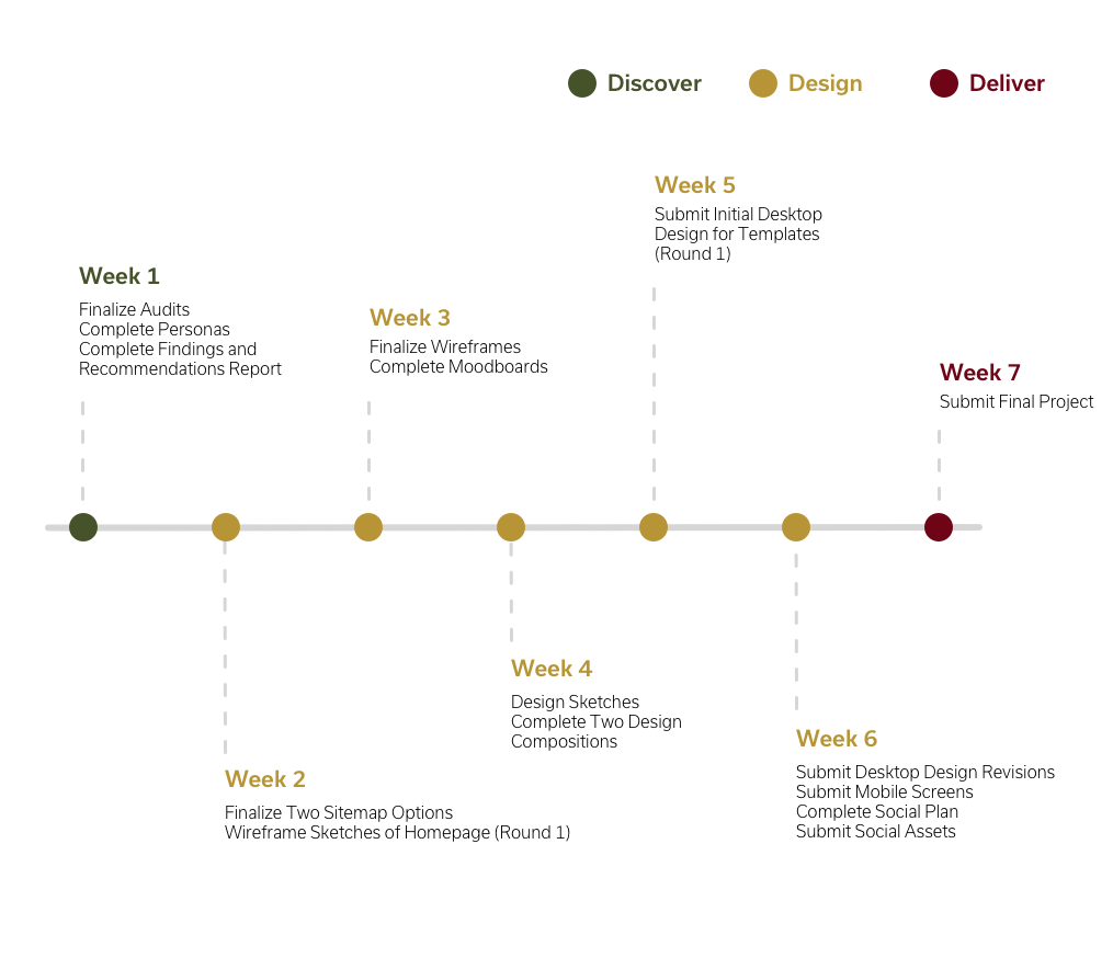
Project Timeline
Discover
Research Methods
Persona Development
Competitive Audit
Social Audit
Heuristic Audit
Content Audit
Stakeholder Interview
Research Findings
After extensive research, I could accurately gauge what was needed to improve the interface of the Centre's website. By allowing the content of the site to be more scannable, users will avoid feeling overwhelmed. Utilizing strong hierarchy will leave the page appearing more organized, and implementing additional graphics will aid in comprehending the copy. User-friendly navigation will reduce users getting lost on the site or running into dead ends. Overall, the site should include more brand assets to create a stronger emotional tie between the company and the user.
Establishing the Problem
Based on the documented research, users seem to be feeling a disconnect with the brand when visiting the website. The lack of brand assets, hierarchy, scannable content, and photography disengages the user, leaving them with the feeling of frustration and disappointment.
Findings & Recommendations
1. Brief but Informative – Use brief and easily scannable content that allows the user to digest the information at their own pace. This will aid in guiding the user through the site.
2. Good Design, for Better Engagement – Display strong design elements such as color, size, and space will aid in more engagement and encourage the user to explore more of the site.
3. Don't Get Lost in the Navigation – Successful navigation will serve as a guide to the user as they can easily find the information they are looking for.
Creating a Solution
After further analyzing the research and digesting the recommendations, to increase engagement online and boost participation in classes and events, I believe redesigning the website is the most reasonable solution.
In addition to the website, it would be beneficial for the design to be responsive on all platforms to ensure the site is user-friendly on any device.
Design
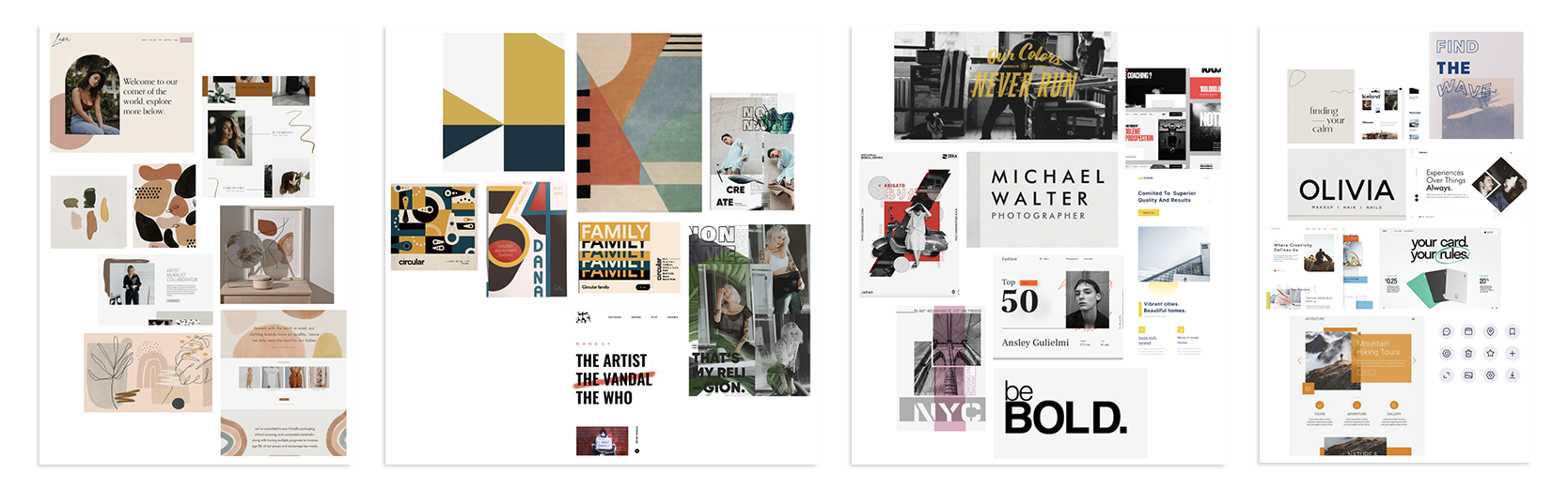
Ideation Process
To ensure that I considered all design possibilities, I created four different moodboards that portray the values and inner workings of the Centre. Shown above.
1. Neutral & Organic
2. Geometric
3. Classy & a Pop of Color
4. Spacious & Breathable
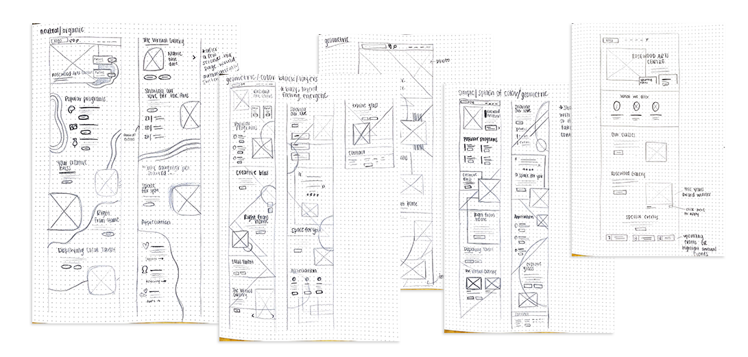
Sketches
To get a better understanding of how to implement these concepts on a web platform, I sketched a homepage layout that incorporated the design style of three of the concepts. After further review, the geometric concept was chosen to represent the Rosewood Arts Centre. This concept will be translated on both desktop and mobile views.
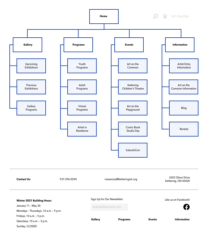
Sitemap
To reduce the risk of user confusion in a complex site, it is important that the navigation is organized and easy to understand. To receive true feedback from new users, I conducted an OptimalSort test. This test provided users with a set of topics to categorize into groups and then assign each group to a navigation tab. Upon completion of this test, I was able to create a user-friendly sitemap that was easily understandable for new users.
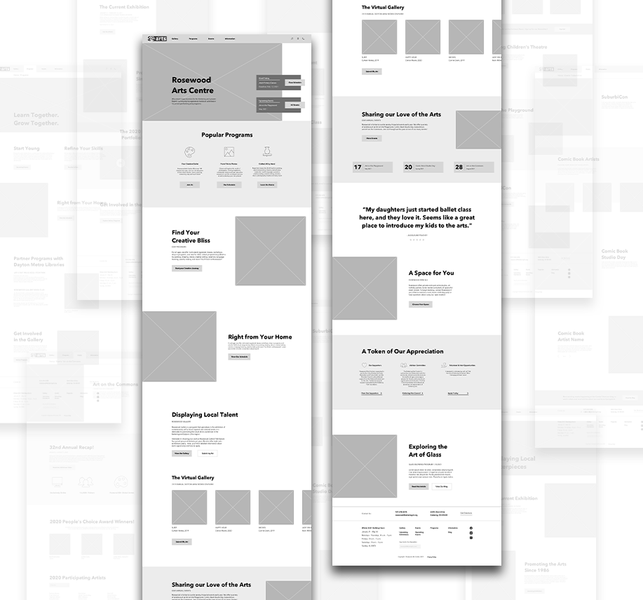
Wireframes
To aid in the user-friendly design, the content is easily scannable and utilizes engaging but informative headlines. Multiple call-to-action buttons will encourage the user to continue exploring the site and increase their interaction with the Centre.
Following the establishment of the wireframe design, I performed a Chalkmark First Click test which provided the user with a list of tasks requiring them to find specific information on the site. The data received from this test allowed me to assess the overall effectiveness of the website.
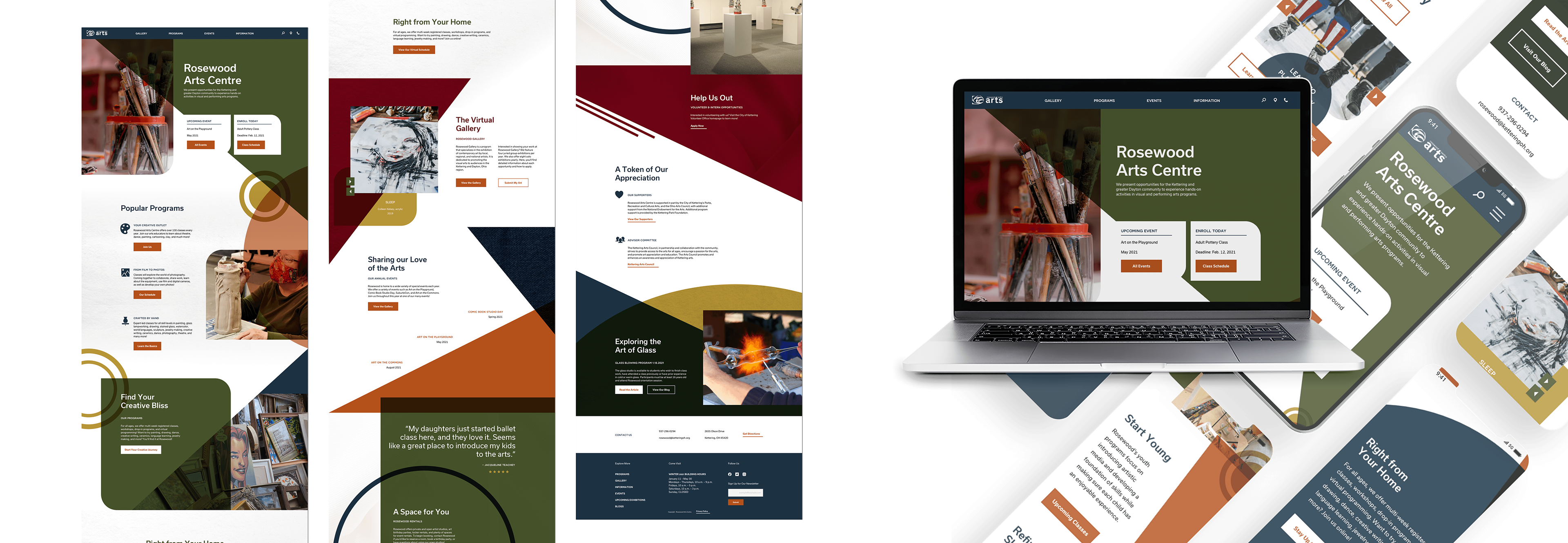
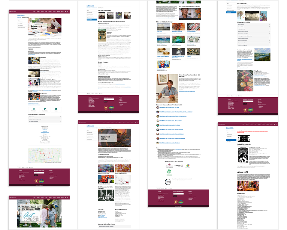
Desktop and Mobile Design
The Rosewood Arts Centre's lively, engaging, and linked atmosphere is reflected in layered geometric patterns. The subdued colors and large shapes in this design encourage the user to generate a sense of excitement and connection.
The site's design is also provided on a mobile device to make the material more accessible. This enables the user to access information from any location at any time. While the design principles are the same across all devices, the graphics will draw attention to the information, which will be easily accessible to all users.
Final Design Test
When the design was fully executed, I performed one final usability test to ensure a user-friendly and engaging design. I requested that two individuals perform tasks that require them to find information on the homepage. Both participants were able to scan the website and digest the content and aided visuals to find the information they needed.
Deliver
Final Regards
Overall, this project has shown me what it takes to complete a full website redesign. I was able to complete extensive research to get a deeper understanding of a new company and its pain points, create and execute multiple user tests to receive true feedback from new users, and present a diverse palette of design alternatives.