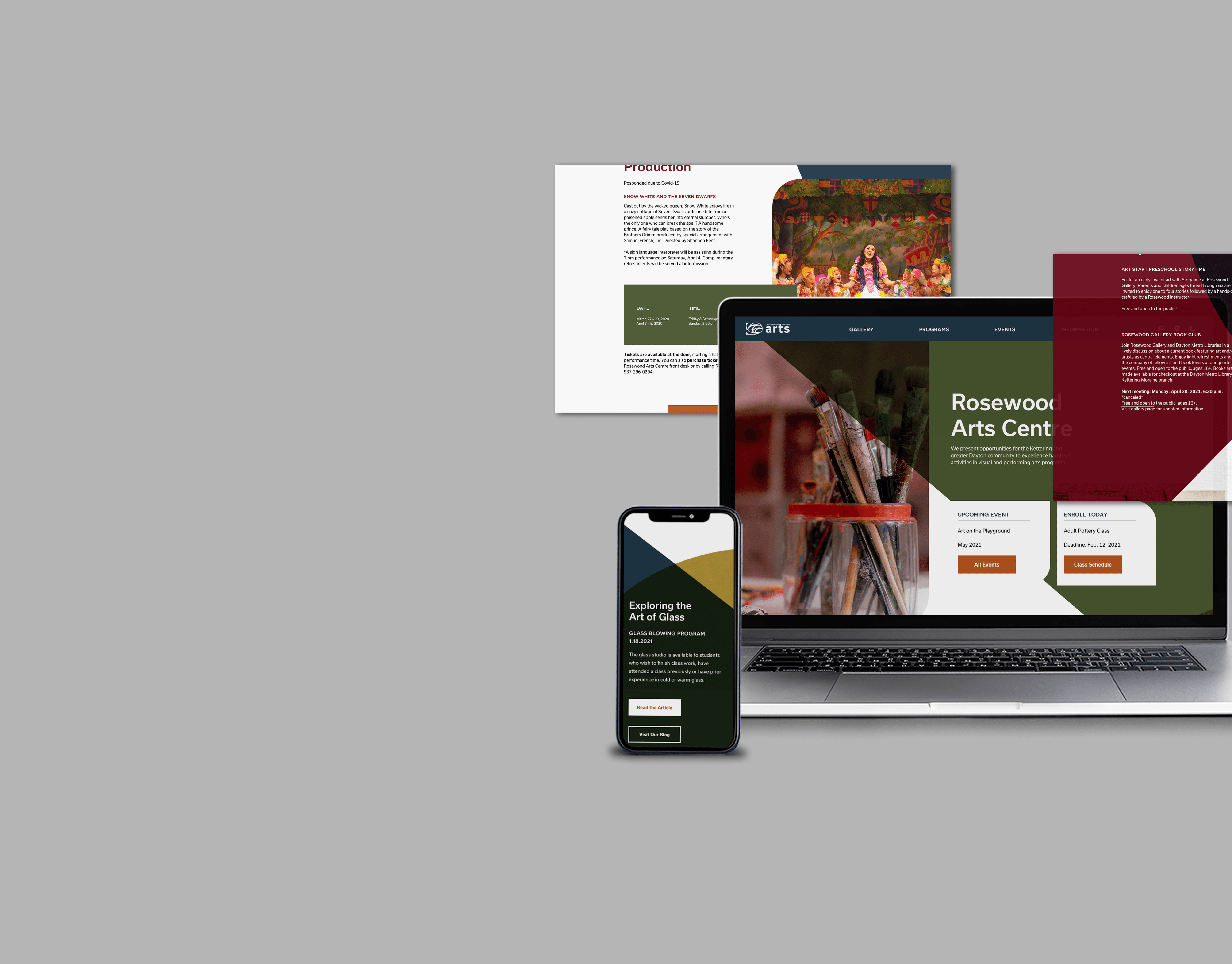
Brand Overview
In 2012, Cassidy Tuttle began growing and experimenting with her own succulents. As a self-taught caretaker, she has made plenty of mistakes and learned what worked best for her plants. Currently, she has grown her collection to over 300 succulents. She created this website to help make caring for them as easy as possible.
The Problem
Although there are plenty of resources integrated into this website, for beginners, there is a disconnect between the verbiage on the site and the overall meaning of the site. The current website is complicated and cluttered with information, sign-up prompts, and downloadable documents. This contrasts with the overall purpose of the website – to show new plant owners how easy succulents are to take care of.
Research & Ideation
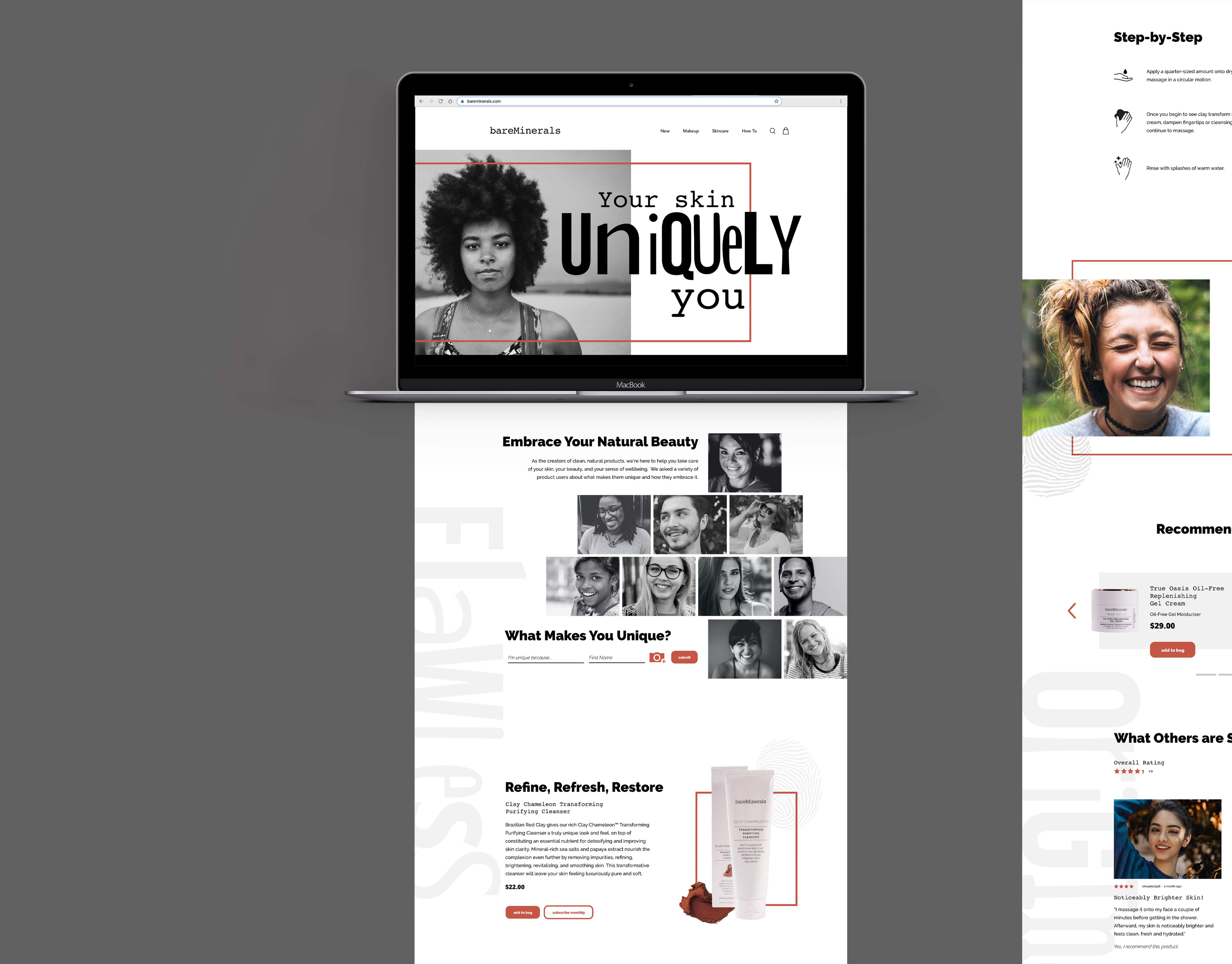
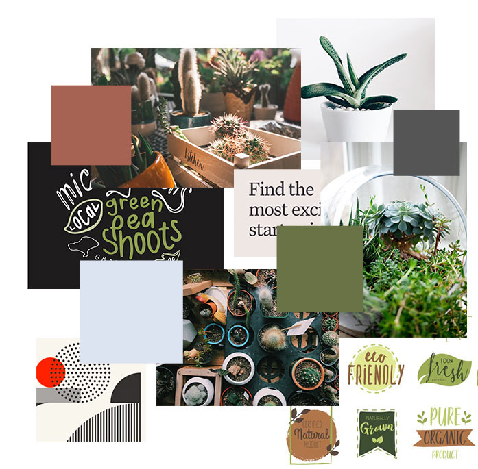
I began to dive deep into the website's marketing and sales, content, design, and overall usability, which allowed me to further my knowledge on how to improve the user experience. After the research phase, I began to develop a moodboard that would best represent the aesthetic of the brand. Incorporating earthy tones and organic typography strengthened the tie between the brand and the user. I had envisioned the website to use a strong grid that would allow content to align and lead the eye of the user throughout the page.
Design Establishment
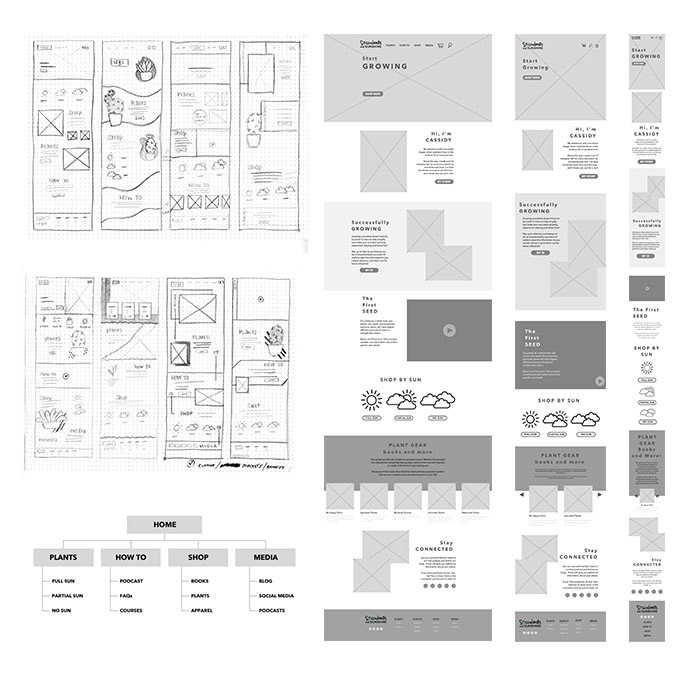
Wireframe
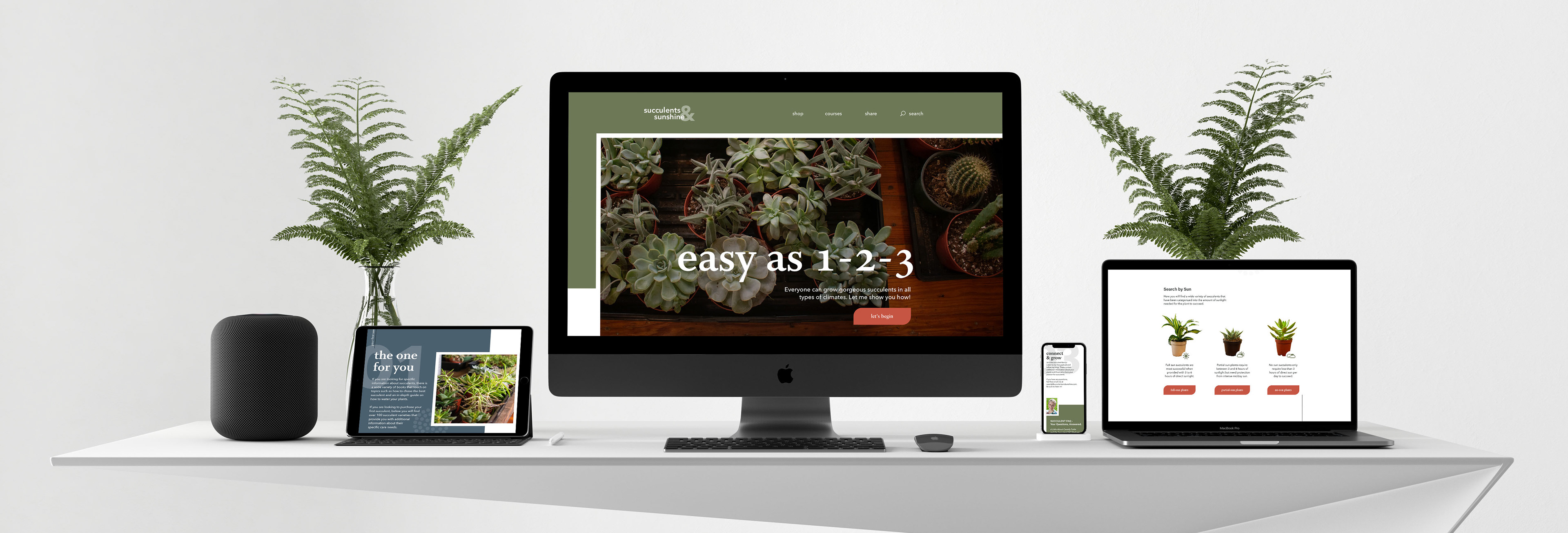
In order to make the website fully user-centered, my first step was to establish the idea of this website being responsive. This will allow any user to view the site from a desktop, tablet, or mobile phone. In addition to the site being responsive, it was important that the user can find the information they needed quickly and easily. The current website has a navigation made up of links that redirect the user to interior pages. Establishing a navigation bar will allow viewers to browse through tabs and digest what information is held inside the sight.
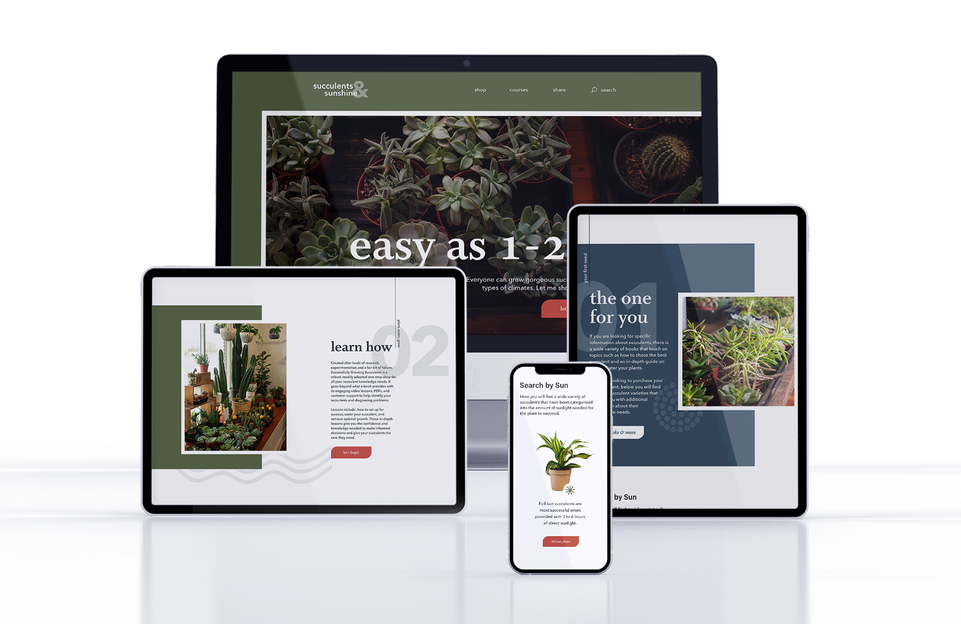
Design
By establishing a user-friendly navigation, amplifying the brand goal, and compressing the content, I was able to create a user-focused design that aligns with the values of Succulents & Sunshine. The mix of earthy tones, organic typography, and hand-drawn illustrations allow the site to feel welcoming and digestible. The content has been simplified and organized into an easy 3-step process. New users are able to scan the sight easily to understand the content, and returning users are able to find what they need easily.
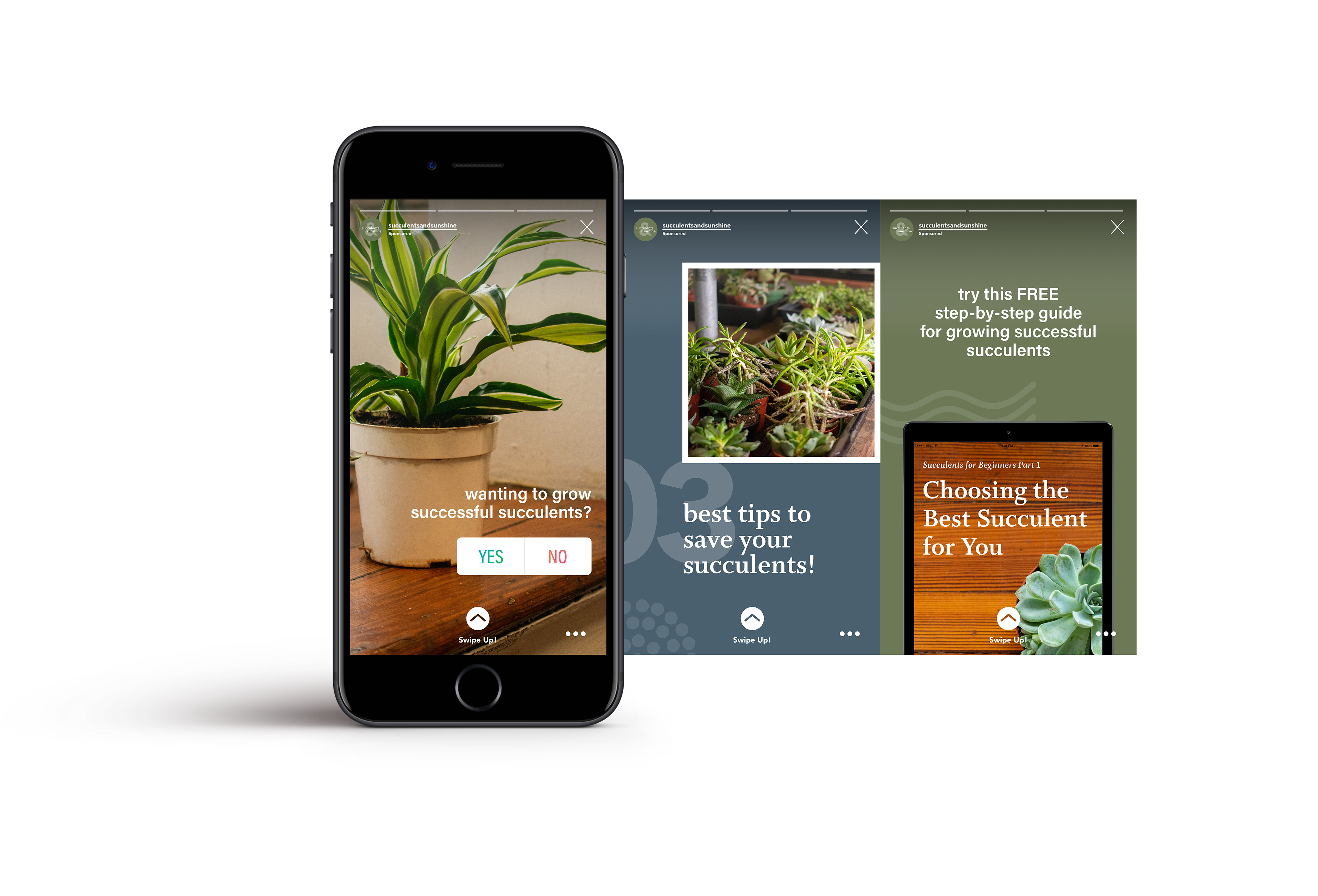
Social Media
With social media on the rise, I included an Instagram story asking followers if they are struggling to take care of their plants and if they are in desperate need of help. By engaging in the Instagram poll, users can directly engage with the brand. Prior to taking the poll, viewers are offered the ability to download a free booklet on the basics of succulents and are redirected to the website.
All photography included in this project was displayed, shot, and edited by me.
All photography included in this project was displayed, shot, and edited by me.
My Learnings
This was my first time completing a full website redesign – three different times. This project allowed me to understand the key elements and best practices that are needed to design for smaller screens to develop a user-centered design. This project will be carried with me throughout my career as I remember to keep these elements in mind.